
Guidelines
The core guidelines are driven by the Vonage Brand Toolkit and are the foundations on which we built our design system. Specifically, these elements are the subatomic elements of all our components.
Design tokens are a set of values that maintain a design system. They represent anything defined by design: font size in pixel, a color, an opacity as a number, etc.
The Design Tokens are the design system’s Single Source of Truth.
The following types of design tokens are the building blocks and design decisions that make up the Vivid design language:
Global tokens - global tokens are the primitive values in our design language, represented by context-agnostic names. Our color palette, typography, and elevation values are all recorded as global tokens. These can be directly used, and are inherited by all other token types.
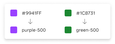
Alias tokens - alias tokens relate to a specific context or abstraction. Aliases help communicate the intended purpose of a token, and are effective when a value with a single intent will appear in multiple places.
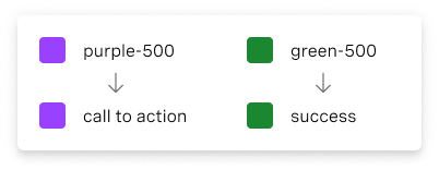
Application of the color palette brings a unified and recognizable consistency to Vonage’s vast array of digital products and interfaces. This consistency is grounded by a set of well-defined rules on how to work with the Vivid component library in the context of dark and light themes.
Vivid’s default theme is derived from the Vonage Brand Identity color palette. Black is our Primary color and the core Purple family serves as the main action color across all Vonage products and experiences. The Neutral Gray family is dominant in our default theme, making use of subtle shifts in value and lightness to help organize content into distinct sections.
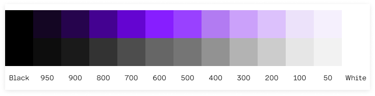
Although we value an aesthetically pleasing use of color, we place a higher value on clear communication. Our use of color should be rational and should serve to support the purpose of the content. The additional brand colors should be used sparingly and purposefully throughout Vonage’s interfaces and applications, and mainly just for decorative purposes.
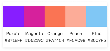
Our brand colors are used to build two distinctive sets of gradients. 2-tone and 3-tone gradients.
Gradients should only be used for decorative and illustrative purposes, never to convey functionality or information.
2-tone gradients

3-tone gradients

To learn more about the usage of 2-tone and 3-tone gradients please review - Vonage’s Brand Identity Toolkit manual.